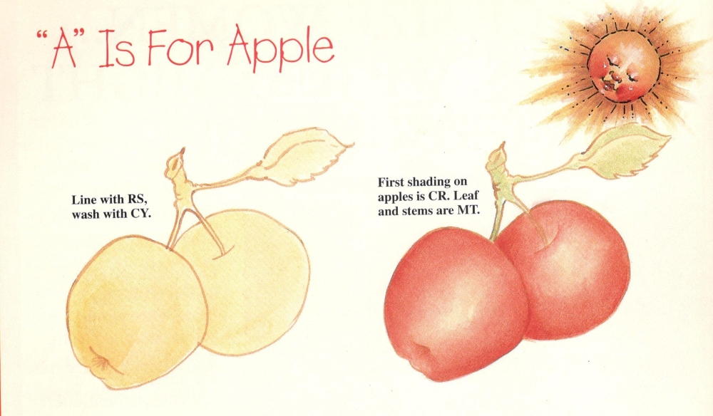
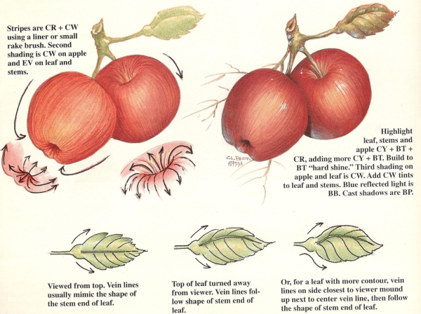
Beginning with the current issue, we will be introducing a new series of articles on how to paint fruit step-by-step. In our “Back to Basics, Fruit Series,” which will feature a different fruit in each issue, we are hoping to introduce you to the various techniques, tools and principles you will need in order to paint luscious, realistic fruit.
Two of the most important elements in creating a realistic, dimensional object are light and shadow. Light is important because it determines where the shading will be placed on the object. Shading is important because it gives the object its form, or shape. There are two types of shading, “dimensional shading” and “cast shadows.” Dimensional shading is the shading of the object itself, the shading that gives contour to the object. Cast shadows are the shadows from nearby objects that fall across the surface of the original object. Cast shadows separate objects from one another and also help give the object form.
Texture is another important element. Think for a moment of the glossy surface of a newly polished red delicious apple. Its hard surface reflects a bright “hard shine,” much like that reflected from a piece of glass. Now think of the soft, fuzzy surface of a peach. Its surface is more like a piece of velvet fabric, and causes light to be absorbed rather than reflected. The peach’s highlight area is very soft and diffused.
Surprisingly, the last element to be considered is the color of the fruit. Can you remember seeing fruit that has been painted in a single (monotone) color, or fruit pictured in a black and white photograph. Even though color has not been used, we can easily identify the individual pieces of fruit. Black and white photographs, or photocopies, are wonderful ways to study an object’s form.
Remember, light and shadow give form, or shape to the object; while texture and color add interest.
The principles used to make an apple appear round are the same principles used to make a face or a ball appear round. It is my hope that the information given in our “Back To Basics, Fruit Series” will translate to all areas of your painting.
How To Make Objects Appear Round


The light source in our “Back To Basics, Fruit Series” will be from the upper right. Think of the light as coming over your right shoulder. (Mr. Sunshine is in the upper right comer of the worksheet as a reminder.) Shading will be on the lower left area of objects and highlighting will be on the upper right area of objects.
After basecoating, which is sometimes just a light wash of color, the first shading should cover approximately
three-quarters of the total area of the object, leaving one-quarter of the area in the lighter background color. Notice that the highlight is not right on the edge of the object, it is placed slightly in from the edge so that shading can be painted all around. (See Fig. 1.)
In order for the shading color to blend softly and easily into the lighter background color in the highlight area, the shading color should be only slightly darker than the basecoat color. The second shading color can be a little darker and should cover approximately one-half of the total area. (See Fig. 2.)
The third shading should be a little darker than the second and should cover about one-quarter of the total area of the object. (See Fig. 3.)
When highlighting, reverse the procedure, going from dark to light. Consider the original background highlight area as a whole. The first highlighting should cover approximately three-quarters of this whole area and, for easier blending, should be only slightly lighter than the background highlight area. The second highlighting will be lighter and should cover approximately one-half of the area. The third highlighting should cover about one-quarter of the area. The final highlight is placed in the center of the third highlight area and can be a “hard shine” or a diffused one, depending on the texture of the surface. (See Fig. 4.)

Fig. 1. After basecoating, bring shading in to cover 3/4 of area.
Fig. 2. Second shading covers 1/2 of area.
Fig. 3. Third shading covers 1/4 of area.
Fig. 4. Highlight color gets lighter as area gets smaller.
Palette
| Deco Art Americana Acrylics | Abbreviation |
|---|---|
| Baby Blue | BB |
| Black Plum | BP |
| Buttermilk | BT |
| Cadmium Yellow | CY |
| Country Red | CR |
| Cranberry Wine | CW |
| Evergreen | EV |
| Mistletoe | MT |
| Raw Sienna | RS |
Special painting tip
If you have trouble “walking” color out into an object without getting a row of stripes, or if you just have trouble sideloading without getting a stripe on the clean side of the brush, I have a magic tip for you. When applying side-loaded color, it’s okay initially to lean the brush toward the paint side of the bristles; however, when you are ready to walk the color out, or soften the edge of a sideloaded float, all you have to do is lean the brush toward the clean side of the bristles. This will force the paint back toward the paint side and give you a clean sideloaded float. Try it, it works!

Leave a Comment