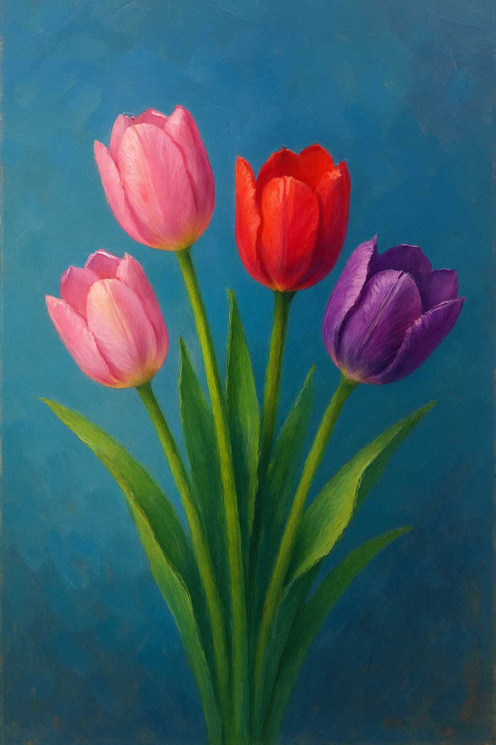
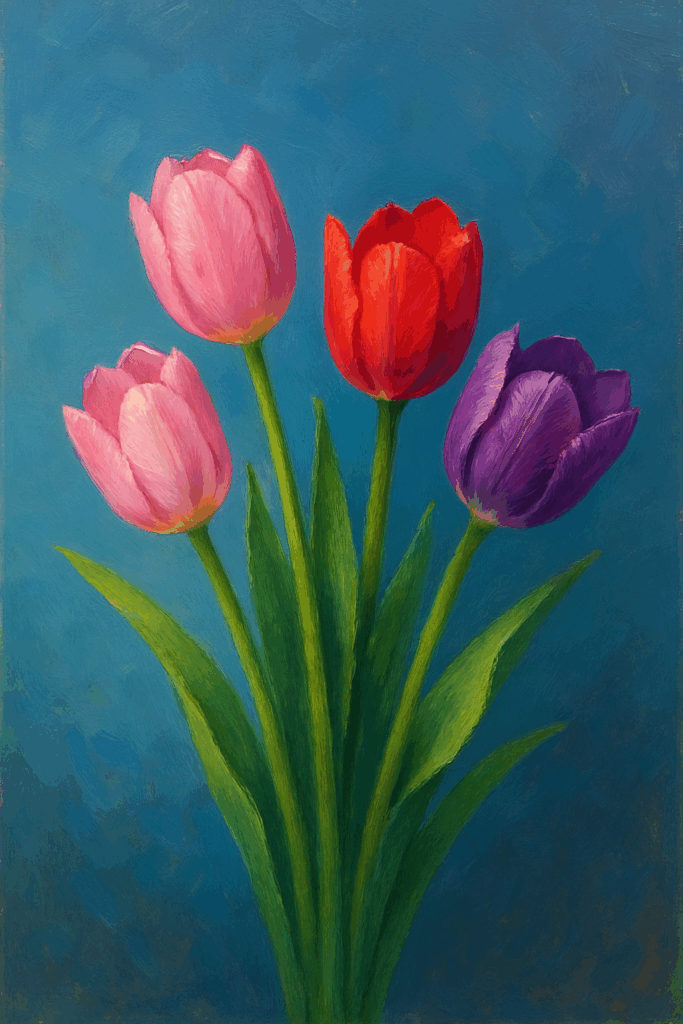
Few flowers signal the arrival of spring more joyfully than tulips. Their elegant, upright posture and bold, beautiful colors bring instant brightness to any space—and to any canvas. For artists, tulips provide an ideal blend of simplicity and expressiveness. Their shapes are gentle and refined, yet their vivid hues offer exciting opportunities for exploring color harmony, gradient transitions, and natural light effects.
Why Tulips Make Great Subjects
Tulips are often celebrated in art because of their graceful structure and versatile color range. Each bloom has a smooth, cup-like form with soft curves that make it easier to draw and paint than more complex flowers like roses or peonies. Their symbolic meaning—renewal, growth, and joy—also resonates strongly in spring-themed artwork, making them popular in seasonal prints, cards, and home décor.
Whether you’re working in watercolor, acrylic, oils, or even colored pencil, tulips are a fantastic way to practice color layering, subtle shading, and light-source awareness.
Setting Up Your Composition
Begin with a light sketch using pencil or a neutral-toned underdrawing. Keep the proportions elongated and elegant—tulips tend to have tall, straight stems and slightly bowed heads. Focus on balance, especially if you’re arranging multiple flowers. An odd number of tulips (like 3 or 5) usually results in a more visually dynamic layout.
For single-flower studies, consider isolating the tulip with negative space to emphasize its form. In larger compositions, let tulips interact with each other by overlapping stems and leaves or placing them at varied angles.
Color Palette and Gradient Techniques
One of the most exciting aspects of painting tulips is the opportunity to experiment with bold, saturated color. Popular petal shades include:
- Soft pinks and deep reds
- Bright yellows and oranges
- Purples, violets, and even striped hybrids
Start with a base layer of your chosen hue and slowly build up intensity by layering translucent washes or gently blending tones together. Watercolors and acrylics work especially well for smooth gradients, as they allow you to fade from dark to light seamlessly. In digital painting, this can be achieved using a soft airbrush and opacity control.
Highlight the outer edges of the petals with a lighter tone or a touch of white to make them appear sunlit. In shadows, opt for a cooler version of the base color—e.g., using magenta or violet shadows for red tulips—to avoid muddiness.
Bringing the Tulips to Life
To make your tulips feel real and full of personality:
- Use long, sweeping brush strokes for the stems
- Vary the angle and shape of each bloom
- Add subtle folds or creases to the petals for realism
- Apply reflected light near the petal edges to enhance dimensionality
Tulip leaves are wide and blade-like, with a slight twist. Their cool green tone often contrasts nicely with the warm petals. Be mindful of how the leaves curve and taper as they add rhythm to the overall composition.
Creative Possibilities
Tulips work beautifully across a range of styles:
- Minimalist: A single tulip with a plain white or pastel background
- Realist: A bouquet arranged in a glass vase with careful lighting and shadows
- Impressionist: Loose brushwork and color dabs to suggest a field of flowers in bloom
Key Artistic Concepts to Practice
- Gradient blending for smooth transitions on petals
- Use of negative space to isolate and highlight form
- Color contrast between vibrant petals and subdued greens
- Light direction and reflective highlights for dimensionality
Painting tulips offers more than just a study in form—it’s a celebration of spring’s beauty, wrapped in color and elegance. Whether you’re creating a small floral piece or a vibrant garden scene, tulips will bring freshness, light, and joy to your artwork.