Every painting tells a story, and color temperature is its mood. Learning how to balance warm and cool tones for stunning paintwork is a skill that elevates your art from flat to dynamic. Warm tones bring energy and emotion, while cool tones add calmness and depth. Together, they create visual harmony that captivates the viewer.
Why Balancing Warm and Cool Tones Matters
Warm and cool tones aren’t just about color—they influence how people feel. Balanced tones add contrast, movement, and emotion to your work. Without balance, paintings can feel dull or overwhelming.
Understanding Warm and Cool Tones
Warm Tones
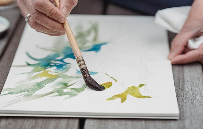
Colors like red, orange, and yellow radiate energy. They suggest heat, sunlight, and passion.
Cool Tones
Blues, greens, and purples calm the eye. They suggest water, sky, and serenity.
How Warm and Cool Tones Interact
Contrast Creates Impact
Placing a warm tone next to a cool one makes both stand out.
Harmony Creates Flow
Blending warms and cools carefully gives balance without harsh separation.
Common Challenges in Balancing Warm and Cool Tones
- Overusing one side of the spectrum creates imbalance.
- Ignoring undertones leads to clashing colors.
- Lighting can distort perceived warmth or coolness.
The Role of the Color Wheel in Balancing Tones
A color wheel helps identify where warm and cool tones fall. Use it to guide complementary and analogous combinations.
Techniques for Balancing Warm and Cool Tones
Start with Dominant Temperature
Decide whether your painting leans warm or cool, then use the opposite temperature as an accent.
Layering for Depth
Warm underlayers with cool highlights—or the reverse—add richness and contrast.
Gradual Transitions
Blend between warm and cool tones instead of abrupt shifts for a more natural look.
Practical Exercises for Mastering Tone Balance
Two-Color Studies
Choose one warm and one cool tone. Paint a simple scene to explore their interaction.
Temperature Swatches
Mix paints to see how subtle shifts from warm to cool affect the mood.
Limited Palette Challenge
Use one warm, one cool, and one neutral to create a painting with strong balance.
How Lighting Affects Warm and Cool Perception
Natural daylight shows true temperature. Artificial lights can make warm colors look cooler or vice versa. Always check your work in consistent lighting.
Using Warm and Cool Tones in Different Subjects
Landscapes
Warm tones in sunsets or soil contrast beautifully with cool skies and water.
Portraits
Warm skin tones balance well with cooler shadows or backgrounds.
Abstract Art
Playing with extremes of warmth and coolness adds drama and emotional weight.
Avoiding Mistakes in Tone Balancing
- Don’t let warms overwhelm cools, or vice versa.
- Avoid ignoring neutral tones, which help unify.
- Don’t forget the context—tone balance depends on subject and mood.
Mindset Shifts for Confident Tone Balancing
Think of warms as the “fire” in your work and cools as the “water.” Balancing them isn’t about rules—it’s about storytelling.
How Balancing Tones Elevates Your Paintwork
Balanced tones make your art visually engaging and emotionally resonant. They draw viewers in and keep their eyes moving across the canvas.
Conclusion: The Art of Warm and Cool Balance
Learning how to balance warm and cool tones for stunning paintwork gives you control over emotion, depth, and harmony. With practice, you’ll know exactly how much fire or calm to add, creating artwork that resonates deeply with your audience.
FAQ
- What’s the easiest way to balance tones?
Choose a dominant temperature and add the opposite as accents. - Can I use only warm or only cool tones?
Yes, but balance through value and contrast is crucial for interest. - How do undertones affect balance?
Undertones shift a color’s temperature slightly, influencing harmony. - Why does lighting change my tones?
Artificial light alters perception. Daylight is best for accurate balancing. - How do neutrals help with tone balance?
Neutrals bridge warms and cools, preventing harsh transitions.